
Call Logicraftz Professionals at
+91 22 3198 2472
for responsive website design, mobile optimization, UI/UX improvement, SEO, website speed enhancement, custom development, ERP and CRM integration, AI automation, and ongoing technical support.
Logicraftz Solutions LLP is a strategic technology partner helping businesses with responsive web design, custom website development, premium UI/UX, SEO, digital marketing, business automation, ERP implementation, CRM solutions, software integrations, and long-term technology support.
Mobile-First Websites Built for Better Results
Mobile-Friendly Website Developer Near Me – Responsive Design
Searching for professional responsive web design near me? Logicraftz creates fast, mobile-friendly, SEO-ready websites that deliver a consistent customer experience across smartphones, tablets, laptops, and desktop devices.
Responsive Web Design Near Me for Modern Business Growth
A modern website must work perfectly on every screen size. Customers may discover your business on a mobile phone, compare services on a tablet, and complete an enquiry from a laptop. Professional responsive web design near me ensures that your website automatically adapts to each device without forcing visitors to zoom, scroll sideways, or struggle with small buttons.
A responsive website does more than improve appearance. It strengthens usability, loading speed, search visibility, customer trust, and conversion performance. Menus become easier to use, content remains readable, forms become simpler to complete, and calls to action stay visible on smaller screens.
Logicraftz builds mobile-first websites around real business goals. We plan page structure, responsive layouts, website speed, SEO, conversion paths, forms, integrations, and long-term scalability so your website becomes a reliable marketing and lead-generation platform.
What Is Responsive Web Design?
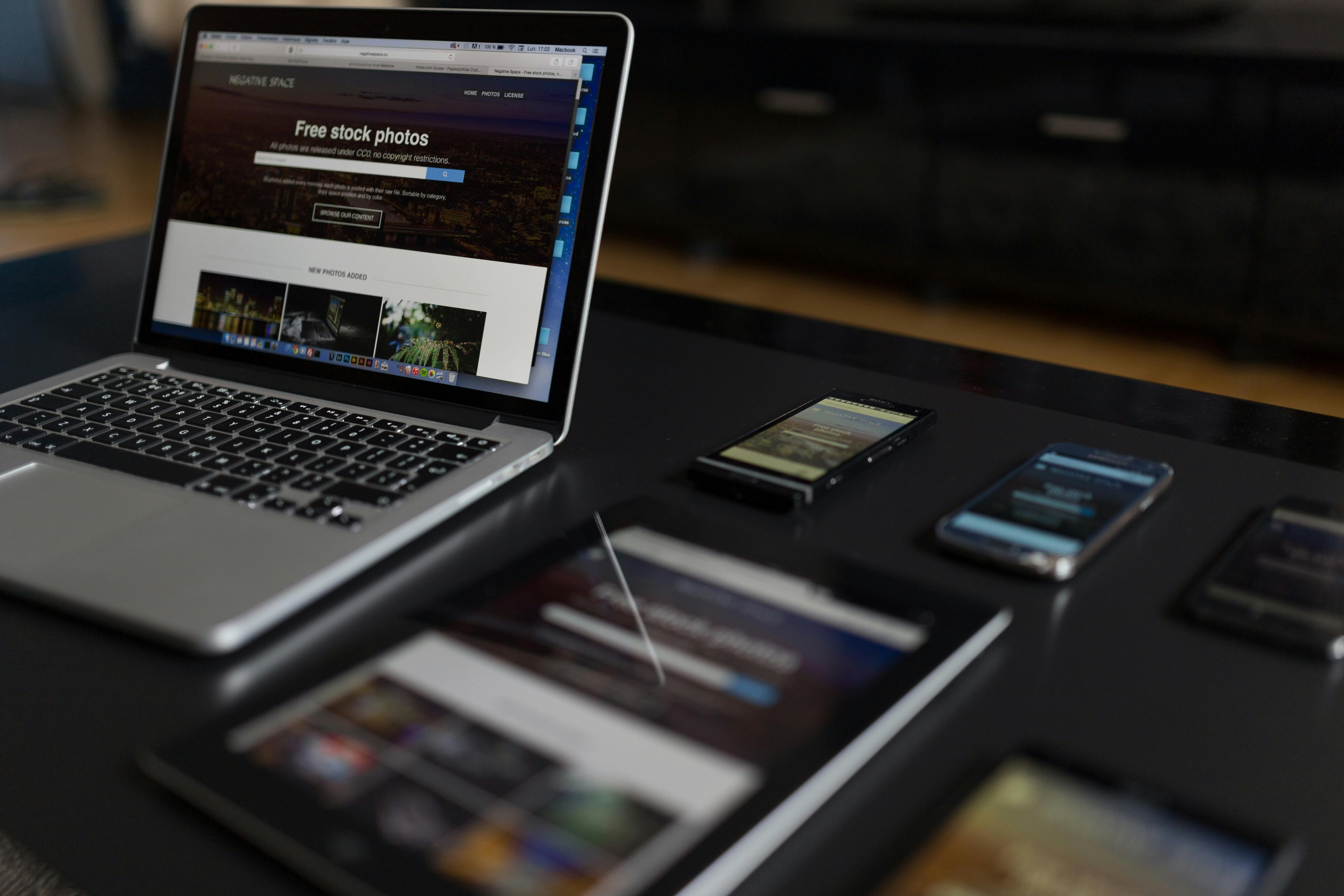
Responsive web design is a development approach that allows a website to adjust automatically according to the visitor’s screen size, device type, and browser width. Instead of creating separate websites for mobile and desktop, one flexible website responds to different viewing environments.
Flexible Layouts
Responsive layouts use flexible widths, spacing, and content areas so pages remain organized across different screen sizes.
Responsive Images
Images automatically scale without overflowing their containers, causing distortion, or creating horizontal scrolling.
Device-Friendly Navigation
Menus, dropdowns, buttons, forms, and interactive elements are adjusted to remain usable on touchscreens and smaller displays.
Why Mobile-Friendly Websites Matter for Every Business
Customers increasingly use smartphones to search for businesses, compare services, read reviews, request quotations, call companies, and complete purchases. A website that performs poorly on mobile devices can create a negative first impression before a customer even understands your offer.
A mobile-friendly website improves readability, navigation, form completion, click-to-call actions, product browsing, and overall customer confidence. Visitors are more likely to stay longer when pages load quickly and information is easy to access.
Responsive development also reduces the need to manage separate website versions. Content, updates, SEO improvements, and design changes can be controlled from one central website.
Choosing the Right Mobile Friendly Website Builder
A mobile friendly website builder can help businesses launch pages faster, but the quality of the final website depends on planning, customization, content structure, and technical optimization.
WordPress Website Development
WordPress supports flexible layouts, responsive themes, content management, SEO, forms, blogs, landing pages, and custom business functionality.
Shopify Responsive Stores
Shopify provides mobile-friendly eCommerce themes, product management, secure checkout, payment integration, and scalable store features.
Custom Website Development
Custom development is suitable when businesses require specialized workflows, unique interfaces, advanced integrations, portals, dashboards, or software functionality.
Why Work With a Mobile Web Developer Near Me?
Hiring a professional mobile web developer near me provides better communication, local market understanding, faster coordination, and ongoing support after the website is launched.
- Clear discussions about your customers and business goals
- Better understanding of local browsing and search behaviour
- Faster testing and revision cycles
- Support for local SEO and Google Business Profile integration
- Quick assistance for campaign pages and website updates
- Long-term accountability and technical support
Complete Responsive Web Development Services
Professional responsive web development services should improve the entire website experience rather than only shrinking desktop content to fit a smaller screen.
Responsive Website Design
Flexible layouts designed for mobile, tablet, laptop, and desktop screens.
Mobile Website Redesign
Modernization of older websites that do not perform correctly on smartphones.
Responsive eCommerce
Mobile-friendly product browsing, filters, carts, payments, and checkout experiences.
Speed Optimization
Image compression, script reduction, caching, and performance improvement.
Responsive Testing
Testing across popular screen sizes, browsers, operating systems, and devices.
Maintenance and Support
Ongoing fixes, updates, performance monitoring, and design improvements.
Local Mobile Web Designer for Better Communication and Support
A local mobile web designer can better understand your audience, service area, competition, industry, and customer expectations. This insight helps create clearer content, stronger calls to action, and layouts suited to local visitors.
Local collaboration also makes it easier to plan location pages, mobile contact features, appointment forms, click-to-call buttons, WhatsApp actions, maps, and local trust signals.
The relationship continues after launch through content updates, landing pages, SEO improvements, campaign support, feature additions, and technical maintenance.
Our Mobile-First Website Development Approach
Mobile-first development begins by planning the website experience for smaller screens before expanding the layout for tablets and desktops. This approach encourages cleaner content, simpler navigation, better prioritization, and faster performance.
Content Prioritization
The most important information, services, benefits, and calls to action are positioned where mobile visitors can find them quickly.
Touch-Friendly Controls
Buttons, form fields, menus, accordions, and links are sized and spaced for comfortable touchscreen use.
Progressive Enhancement
Additional design details and advanced layouts are added for larger screens without weakening the mobile experience.
How Responsive Design Supports Search Engine Optimization
Responsive design and SEO work together because search engines evaluate usability, mobile performance, content accessibility, page structure, loading speed, and technical quality.
- One consistent URL for mobile and desktop visitors
- Improved mobile usability
- Reduced duplicate content risk
- Better content accessibility
- Faster loading through optimized assets
- Improved engagement and lower frustration
- Clear heading and internal linking structure
- Better support for local search visitors
Useful technical guidance is available from Google Search Central and web.dev responsive design guidance.
Mobile Website Speed and Performance Optimization
Mobile users may access websites through slower networks or lower-powered devices. Heavy images, excessive scripts, poorly configured plugins, and unoptimized layouts can make pages difficult to use.
| Performance Area | Common Problem | Recommended Improvement |
|---|---|---|
| Images | Oversized files delay page loading. | Compress images and use correct dimensions. |
| Scripts | Too many scripts block rendering. | Remove unnecessary code and delay noncritical scripts. |
| Fonts | Multiple font files increase requests. | Limit font families and weights. |
| Plugins | Unused plugins add code and database load. | Keep only essential, maintained plugins. |
| Hosting | Slow servers increase response time. | Use reliable hosting and caching. |

Responsive UI/UX Design for a Better Customer Journey
Responsive UI/UX design focuses on how visitors move through the website, understand information, complete actions, and interact with content on different devices.
Readable Typography
Comfortable font sizes, line spacing, and contrast for mobile screens.
Simple Navigation
Menus and categories that help visitors reach important pages quickly.
Clear CTAs
Visible buttons for calls, enquiries, quotations, bookings, and purchases.
Shorter Forms
Mobile-friendly forms that request only necessary information.
Mobile Conversion Optimization
A responsive website should guide mobile visitors toward meaningful actions. Conversion optimization improves the clarity and convenience of the customer journey.
- Sticky click-to-call buttons
- WhatsApp enquiry integration
- Short consultation and quotation forms
- Clear service benefits above the fold
- Visible testimonials and trust indicators
- Simple appointment booking
- Readable pricing and service comparisons
- Fast product and service page loading
- Clear next-step instructions
Responsive Website Solutions for Different Industries
| Industry | Important Mobile Features | Primary Business Goal |
|---|---|---|
| Local Services | Click-to-call, maps, enquiry forms, service areas. | Generate local leads. |
| Healthcare | Appointments, doctor profiles, directions, FAQs. | Increase patient enquiries. |
| Manufacturing | Product catalogues, technical data, quotation forms. | Generate B2B opportunities. |
| Retail and eCommerce | Product search, filters, cart, payments, checkout. | Increase online sales. |
| Education | Course pages, admissions, downloads, contact forms. | Increase applications. |
How Much Does Responsive Website Development Cost?
The cost depends on the number of pages, design complexity, content, custom features, eCommerce requirements, integrations, animations, SEO, performance optimization, and maintenance support.
| Website Type | Typical Requirements | Complexity |
|---|---|---|
| Basic Business Website | Core pages, contact form, responsive layout, basic SEO. | Low |
| Growth Website | Custom sections, service pages, blog, lead funnels, analytics. | Moderate |
| Advanced Website | Portals, eCommerce, integrations, automation, custom workflows. | High |
Our Responsive Website Development Process
1. Business Discovery
We understand your services, customers, competitors, conversion goals, and technical needs.
2. Website Planning
We define pages, navigation, content priorities, forms, integrations, and SEO structure.
3. Responsive UI/UX
We design mobile-first layouts that remain effective on larger screens.
4. Development
We build responsive pages, forms, functionality, SEO elements, and integrations.
5. Testing
We test screen sizes, browsers, forms, navigation, performance, and usability.
6. Launch and Support
We launch the website, configure analytics, and provide continued improvements.
Why Choose Logicraftz Solutions LLP?
Logicraftz creates responsive websites that combine design quality, mobile usability, SEO, speed, conversion strategy, integrations, and long-term scalability.
We work as a technology partner rather than only a website design company. Our team supports responsive web development, UI/UX design, ERP, CRM, AI automation, software integrations, SEO, digital marketing, maintenance, and business process improvement.
| Logicraftz Service | What We Deliver | Business Value |
|---|---|---|
| Responsive Web Development | Mobile-first business websites, landing pages, blogs, and portals. | Better usability and lead generation. |
| UI/UX Design | Clear interfaces, navigation, conversion paths, and responsive layouts. | Improved customer experience. |
| SEO Services | Technical SEO, content structure, metadata, links, and local optimization. | Stronger search visibility. |
| ERP and CRM Integration | Connected leads, customers, forms, operations, and reporting. | Reduced manual work. |
| Maintenance and Support | Updates, fixes, monitoring, performance work, and new features. | Long-term stability. |
Explore More Logicraftz Services
Frequently Asked Questions
What is responsive web design?
Responsive web design allows a website to adjust automatically to different screen sizes, including smartphones, tablets, laptops, and desktops.
Why is a mobile-friendly website important?
A mobile-friendly website improves readability, navigation, speed, customer trust, search visibility, and conversion performance for smartphone users.
Can my existing website be made responsive?
Yes. An existing website can often be redesigned or optimized for mobile devices, although older websites may require a complete rebuild for better performance.
Does responsive design improve SEO?
Responsive design supports SEO by improving mobile usability, content accessibility, performance, engagement, and consistency across devices.
How long does responsive website development take?
The timeline depends on page count, content, design complexity, integrations, custom features, revisions, and testing requirements.
Does Logicraftz provide ongoing website support?
Yes. Logicraftz provides content updates, technical fixes, security work, performance improvements, SEO support, and new feature development.
Ready for a Faster, Mobile-Friendly Website?
Talk to Logicraftz about responsive web design, mobile optimization, SEO, UI/UX, performance improvement, and a website built to support long-term business growth.
Final Thoughts
Choosing professional responsive web design near me helps your business provide a reliable and consistent experience across mobile, tablet, laptop, and desktop devices.
Whether you need a mobile friendly website builder, an experienced mobile web developer near me, complete responsive web development services, or a dependable local mobile web designer, Logicraftz Solutions LLP provides scalable, SEO-focused, and business-oriented website solutions.
Table of Contents
Investing in professional responsive web development services is one of the most important decisions a business can make in today's digital marketplace. Customers expect websites to load quickly, display correctly on every device, and provide a smooth browsing experience regardless of whether they are using a smartphone, tablet, laptop, or desktop computer. When a website fails to meet these expectations, visitors often leave within seconds and choose a competitor instead.
Responsive development is much more than adjusting the size of a webpage. It involves carefully planning layouts, navigation, typography, images, forms, buttons, and interactive elements so they automatically adapt to different screen sizes. Every page should remain easy to read, simple to navigate, and visually appealing without forcing users to zoom or scroll horizontally.
Professional responsive web development also contributes to better business performance. A responsive website improves customer engagement, increases enquiry submissions, supports online sales, and creates a stronger first impression for new visitors. Businesses that prioritize responsive design often experience lower bounce rates, longer session durations, and higher conversion rates because customers can easily interact with the website on any device.
As technology continues to evolve, new screen sizes and browsing devices will continue to emerge. A professionally developed responsive website is built with flexibility in mind, allowing businesses to adapt to future technology changes without rebuilding the entire website. This long-term approach protects your investment while supporting continuous business growth.
Mobile Friendly Website Builder That Supports Business Growth
Selecting the right mobile friendly website builder is an important step toward creating a successful online presence. While many website builders provide ready-made templates, the real value comes from customizing those templates to match your business goals, customer expectations, and marketing strategy.
A professionally developed mobile-friendly website focuses on performance rather than appearance alone. Every section should be designed to guide visitors naturally through the customer journey. Important information such as services, products, testimonials, pricing, and contact details should be easy to find regardless of the device being used.
Modern website builders also allow businesses to integrate advanced functionality including appointment booking systems, enquiry forms, customer portals, online payments, blogs, live chat, CRM connections, ERP integration, and marketing automation. These features help businesses streamline daily operations while improving customer satisfaction.
Scalability is another important consideration. As your business expands, your website should be capable of supporting additional landing pages, service categories, product listings, multilingual content, customer accounts, and advanced reporting without sacrificing speed or usability.
Working with experienced developers ensures your website builder is configured properly from the beginning. Instead of relying on default settings, every page is optimized for search engines, mobile performance, accessibility, and conversion optimization to deliver measurable business results.
How a Local Mobile Web Designer Creates Better Customer Experiences
Choosing a local mobile web designer provides significant advantages beyond technical development. A local designer understands regional customer behaviour, local competition, search trends, and business expectations. This local knowledge allows websites to be designed specifically for the audience they are intended to serve.
Customer experience begins the moment a visitor opens your website. A professional designer carefully considers navigation structure, page hierarchy, colour schemes, typography, content organization, and call-to-action placement. Every design decision is intended to help visitors quickly find the information they need while encouraging them to contact your business or request additional information.
Accessibility also plays an increasingly important role in responsive design. Larger touch targets, readable fonts, sufficient colour contrast, descriptive headings, and keyboard-friendly navigation improve usability for a wider range of visitors. These improvements create a more inclusive browsing experience while supporting better search engine optimization.
A local mobile web designer also provides valuable long-term support after launch. Businesses regularly require seasonal landing pages, promotional banners, service updates, new product pages, blog content, and performance improvements. Having a trusted development partner ensures these updates can be implemented quickly while maintaining a consistent user experience across the website.
Why Businesses Continue to Choose Responsive Web Design Near Me
The demand for responsive web design near me continues to increase because businesses recognize that mobile users now represent a significant portion of website traffic. Whether someone is searching for a local service provider, comparing products, reading reviews, or requesting a quotation, they expect the website to function perfectly on every device.
A responsive website builds trust by presenting a professional image across smartphones, tablets, laptops, and desktop computers. Visitors are more likely to stay longer, explore additional pages, and complete enquiries when the browsing experience feels smooth and intuitive. Combined with strong SEO practices, fast loading speeds, and conversion-focused design, responsive development becomes one of the most valuable investments for long-term digital success.
By partnering with experienced professionals offering responsive web design near me, using a reliable mobile friendly website builder, working with a skilled mobile web developer near me, investing in comprehensive responsive web development services, and collaborating with a trusted local mobile web designer, businesses can create websites that not only look professional but also generate leads, improve customer engagement, and support sustainable business growth for years to come.